


Make the most of new YouTube Handles
Serve your community through YouTube. Converting audio to YouTube videos while maintaining your branding.

This article will help community builders make their audio content pop on a visual channel - YouTube; helping you to make the most of the new YouTube Handles feature.
Over the next while YouTube is rolling out the introduction of Handles, an easier way for creators and their followers to find each other on YouTube. There is an official YouTube blog here, and the excerpt from the post here sums up the thinking.

@Voxgig
We have had a successful podcast since 2018 with 70 episodes available anywhere you get your podcasts - except YouTube. Recently we tasked a member of our team, Saorla, with converting our archive of audio content to “video”. The purpose was to make the content available and attractive on YouTube. We were retrofitting - we do not video the podcasts therefore we had to come up with a way to brand the videos and provide relevant information without overcrowding the audio content. Saorla knocked it out of the park!
Our first job was to wake up our YouTube channel. This is relevant, as the Handles are being rolled out gradually, and taking activity in to account (as described in their official blog above), so dust off your old subscription, or create a new. In the channel set up, you’ll see the “customise” button, and there you’ll find “basic info” tab. It is on this tab you will be invited to create your unique handle.
Our handle is @Voxgig, and when the link is copied and pasted in to a text doc it appears like this: Voxgig - YouTube, so the link was added and the destination is our channel with our live videos.
Next, Saorla had to gather the graphic assets we had, but create a style and format that suited YouTube. She kept a journal of her thoughts and decisions, so here it is for your guidance and support as you prepare to convert audio to YouTube content, or enhance your existing video content with a more consistent style.
Saorla’s Journal of Adding Images to Audio
My task was to create a visual image that could be displayed alongside the podcast recordings of the “Fireside with Voxgig” podcast to be posted to YouTube. The image should fit with the theme of the podcast and demonstrate key information, such as the podcast name, host’s name, guest’s name, pictures of both people, episode number, etc.
For this project, I thought it would be a good idea to have three images as visuals for the podcast:
a title screen that would appear at the start of every podcast video, lasting a few seconds,
an episodic screen that would display the episode number and/or title & a visual of the guest being interviewed that would be the visual for the rest of the length of the podcast,
an “end” screen that would show social media handles and other information on where to find us.
The tools
The title screen would be a permanent staple of all video podcasts posted to YouTube, while the episodic images would change depending on which guest was featured each week. My goal was to create an image in Google Slides that I could then turn into a “Theme” - a.k.a. a template that could then be used for every episode as needed.
I began the process by thinking about the composition of the Title screen. I thought it was important to show both the name and picture of the host, Richard and to prominently display the Voxgig logo. I had an image of him to work with, as well as a number of pre designed logos to choose from. One of the company’s branding colours is red, so I decided to have that be the background, as plain white can be a bit harsh. However, I didn’t want the red to be too overwhelming so I made the image of Richard quite big, covering almost half of the screen.
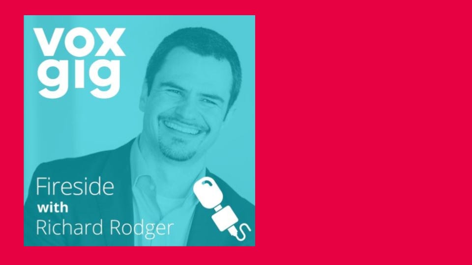
When it comes to the composition of things like video thumbnails or posters, any kind of promotional material, human faces are a big thing, as our eye is naturally drawn to them. So I knew that it would be important to feature the images of the people predominantly.
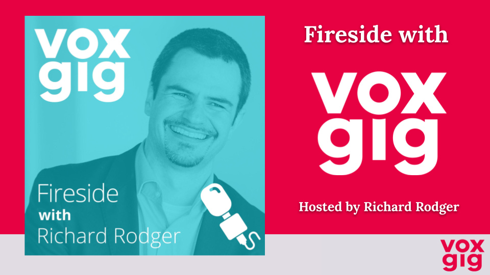
Screen aspect
Because the YouTube display screen has an aspect ratio of 16:9, this means that it is wider than it is tall, a rectangle, but I was working with a square image, which meant it either had to go in the middle or to the side. If it went in the middle, then this would leave limited space for text and make it hard to achieve symmetry or balance, two things that I thought were important to have in the final image. So I decided to put it to the left side. But now there was this big, empty space on the right.
In this space I put the title of the Podcast, with the word “Voxgig” not written in text, but imposed in the logo format, and then “hosted by Richard Rodger”. This information was not entirely necessary to put on display, as the image of Richard already contained both his name and the title of the podcast in it, but it helped to achieve a balanced look in the image, which was important to me, even if it meant repeating information - which in itself is not necessarily a bad thing. Repeating the logo of the company helped to tie all the elements of the picture together.

Along the bottom I placed a banner featuring the Voxgig logo, which worked well visually, but the problem was that the banner we had on file was about half the width required to fill the 16:9 ratio of a YouTube screen, so I tried to stretch it out, which would have been possible with just a block colour - but because the banner featured text, stretching it resulted in the logo becoming very stretched out as well.
The solution I came up with was to take a screen grab of the plain grey part of the banner, and then simply place that right next to the banner (at its original width) at the bottom of the screen. Because they were the exact same colour, when I placed them right next to each other, you couldn’t tell that they were two separate images, and it appeared to be a singular banner at the appropriate width.
I then moved onto the secondary, or episodic image, which would be the one on screen for the duration of the podcast after the title screen disappeared. This would also serve as the thumbnail, so as to advertise each episode by the guest featured on it.
Finer details
For this I decided to keep the format mostly the same, except reversed, so that the image of the guest would feature on the right hand side of the screen and the blank space would be on the left. I made two separate versions of what might feature in this blank space. Firstly, “Episode X - Guest’s Name”, and secondly, “Episode X - Title - Guest’s Name”. I did this because the older podcast episodes are simply titled by their number and guests, while some of the newer ones also have titles relating to the content of the podcast, and so the two formats would work for all of our existing podcast episodes, as well as ones we might do in the future. I also added a white line above and below the text, as there was a little bit too much empty space and it was throwing the image off a bit.

At the end I felt that something was missing. I felt like there was something off about the text in the images - I wondered if it needed a different font or an outline or something to make it look a bit less flat against the background. When I went into the format setting I found an option to add a drop shadow, which gave the text that little bit of depth that I was looking for. This really helped in making the image look more “finished”.

Lastly, I wanted to create the “end” screen. This would appear during the outro of the podcast when the host Richard is summing up. For this I inserted our handles to the Twitter and LinkedIn of the company, and small images to go along with them. I referenced them to our newsletter, which they could subscribe to via the link in the description. Finally, I added a final promotional image of the podcast to fill out the rest of the screen.

Great work Saorla! She has shown that with a bit of time, thought and readily available tools, you as a community builder can repurpose audio content and serve your community via YouTube.
We look forward to providing our podcast archive to a growing audience over the next few months, and as with my articles on entrepreneurship which I cover here too, I’ll give honest feedback as we see how our Handle performs!
Wishing you every good luck with your community building activities.
Find our Fireside with Voxgig podcast wherever you get your podcasts: RSS link here
The second edition of my book The Tao of Microservices is available here. Use the promotional code au35rod for 35% discount.